
In this anniversary year of the Happy Human symbol, BHA Communications Manager Liam Whitton explores the humble origins of a symbol for Humanism seen all over the world today.
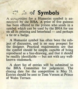
Back in 1965, the British Humanist Association had one simple request of its members: to create an internationally recognisable symbol of Humanism.
Little did the Association know, when it ran an ad in the April 1965 edition of Humanist News, that it would be creating a symbol which would stand the test of time.
The editor of the newsletter, Lindsay Burnet, described the BHA’s needs plainly:
A Humanist symbol has often been the subject of discussion, and is no easy prospect for the designer. Practical requirements are that the symbol should be simple, capable of being reproduced as a line-drawing, and that it should be readily identifiable – but not with any well-known trademark.
Lindsay’s letters say that the BHA received around ‘150 drawings… varying in size from one inch square to one 20 x 15 inches. Submissions included ones from Australia and Mexico and one from a Canadian firm of undertakers!’
Clearly many people had been animated by the promised prize of five guineas(!) but a majority of the entrants were, in truth, less than great. From ‘time to time’, Lindsay recalled, staff would ask his opinion of a new image and he would say ‘Not much.’ But soon came the winning drawing, by one Dennis Barrington. The response to it was instantaneous and unanimous: they had found their winning symbol.
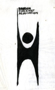
The winning design, by ‘Dennis Barrington of North London’
The effect was electric, the common reaction of most of us who saw it for the first time. The artist was Dennis Barrington of North London.
The winning design was then announced in Humanist News two issues later, in its July-August edition. It described the winning entry as follows:
The successful entry, reproduced here, was felt to be outstandingly the best. It is simple, attractive and relevant. Everybody will find his or her own significance for it, for one of its good points is that it is not restricted to one interpretation. I think of it as a personable and happy anonymous gentleman, but to one member of the Committee it recalled an engineering section!
It was no doubt this universalism which stood the logo in good stead; and by the next edition of Humanist News it was firmly established as part of the official design of the newsletter. But it did not end here. Other international humanist groups soon adopted this logo for themselves, and the International Humanist and Ethical Union was already 13 years old by this time. Not many years on from 1965, humanist organisations across Europe, Africa, and America were using the Happy Human in their logos.
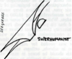
Not a winning design: the Superhumanist (taken from Humanist News, September 1965)
It’s known that Barrington was already a successful designer. He had won several design competitions by the time he designed the BHA logo, and specialised in producing murals, collages, and assembles, but for the most part he earned a living as a window-dresser in London, where he lived with his wife and two children after living for fourteen years in Rhodesia. What was remarkable about Barrington’s involvement was that the Association very nearly missed him. He had only recently arrived in the UK and discovered the BHA in January that same year thanks to an ad in the Observer; had he not joined as a member when he did, he would not have seen the call for a new symbol!
By 1980, his creation was already truly established; there were Happy Humans (then known as the ‘Happy Man’) established in Holland, the USA, and South Africa. It was emblazoned in letterheads from all corners of the world in letters to UN ambassadors and to newspaper editors and government ministers; on the buildings of fine humanist organisations, certainly across Europe; and then not too many years later, on some of the earliest websites of any UK charities or civil society groups.

The logo for the Uganda Humanist Schools Trust, one of many international organisations motivated by a humanist worldview in 2015
As is often the case it’s easy to overlook precursors and originators and see the story as beginning with Dennis Barrington’s design. But as Lindsay Burnet said when the competition was first announced, the idea of a symbol of Humanism had been widely discussed. To think that for over a dozen years, the International Humanist and Ethical Union could have operated with no symbol of its identity as it worked across continents and language barriers is remarkable.
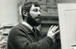
Tom Vernon, in his days working for the BHA. Long before finding fame with the BBC, Vernon had already found a place in history when he commissioned the competition that would one day produce the Happy Human.
The charge to come up with a logo is largely credited to one Tom Vernon, who ran the competition to find a symbol. For his involvement, Vernon, then the BHA’s Press and Public Relations Officer, had already found a reason to be remembered in the years after he died, but in any case would later become a popular BBC radio broadcaster, known to millions for his travelogue series Fat Man on a Bicycle. Before finding notoriety with the BBC, Lindsay Burnet joked about Tom’s place in the annals of history, saying ‘he qualified perhaps as “the onlie begetter” of the Happy Human symbol’.
Incidentally, Tom’s competition is the inspiration for a new BHA competition launched 50 years on, which like his, daringly aims to find visual images for a concept which can be hard enough to pin down in words. In May, the BHA announced it would be hosting a competition for the modern age: a photography competition for all ages, asking for photos which symbolise all that it means to be happy.
But while Tom was heavily involved in the competition and in the process which found the logo, it should also be remembered as a story of two Margarets. In a 1980 letter to the same publication he once edited, Lindsay Burnet rebuked himself for omitting an important piece of the story in his previous write-ups. Shortly before Tom’s competition, BHA member Margaret Dootson had presented a motion at the BHA Annual Conference that steps should be taken to find a symbol, and her motion was seconded and championed by another Margaret, the psychologist Margaret Knight. Knight was already well-known to post-war Britain for her BBC radio presenting, and for shocking the nation with her (now uncontroversial) suggestion that religion and education should be kept apart.
With Knight’s support it was quickly passed, and this ‘set in train’ the process of poring over dozens and dozens of designs in what seemed like an impossible task: creating a symbol which, with time, would come to stand for the whole of the human endeavour, and for all it meant to be in charge of one’s own destiny.
‘Wherever Humanism is to be found in the
world, the symbol is to be found.’
–Lindsay Burnet, Humanist News, November 1980
Special thanks to Nicola Hilton at the Bishopsgate Institute for helpfully providing scans of archived BHA documents going as far back as 1965.
Why do the BHA produce such small Happy Human badges? Freudian or not?
lmal briscoe the humanist badge should be the happy human logo on a round pin badge like the heart foundation,s simple heart shape and nothing else
Good idea. Humanists do not talk enough about love and emotions in general. Hands in the air means that you are motivated and have used your brain to make a discovery or just be joyful. Heart is still a powerful motivator.